
Change is good, right? It’s also a little nerve-wracking and a little exciting. This month, we are unveiling a new logo – a very new logo, quite a step away from the old logo. That change represents a lot of progression here at the magazine. And without question, it is all good.
It began with Jon Stewart. He has been on my bucket list of celebrity covers for about four years. We’ve been formally asking for the interview for two years, maybe more. Last summer, I told writer Terri Akman if we were ever going to get a “yes,” it would be soon because his new movie was about to be released. I figured there was a good chance he would be giving press interviews for that.
He was. And Terri got to travel to Manhattan for the interview. That “get,” that invitation to New York, symbolized something much bigger for us. The magazine has grown each year in page count and ad sales, but this was something different. 2014 was a year that took us to a new level. And we needed a logo that screamed: “Take a look. We’ve got something really remarkable going on here.”
Our biggest introduction last year was our television show, “This is South Jersey with Marianne Aleardi,” which has been airing on NJTV for a few months now. The show is a success. We’re getting great feedback, impressive audience numbers and sponsors willing to purchase spots on the show. (I’m so grateful for that.) I especially love the program, because so many people tell me they saw a place or event they didn’t know existed in South Jersey – and now they want to go there and take their family. That’s the whole reason we do the show: Too many people have no idea how much our towns have to offer.
Add to Jon Stewart and the TV show: Anthony Bourdain agreeing to appear on our August cover – he was also a long-timer on the celeb bucket list. AND, we finally found beautiful, larger office space. (I’ve been looking for two years!) AND, we also solidified a committed and passionate team at the magazine. Toward the end of the year, we realized we needed a logo that marked the progress.
Wait, this year marks our 15th anniversary – that is worth celebrating too!
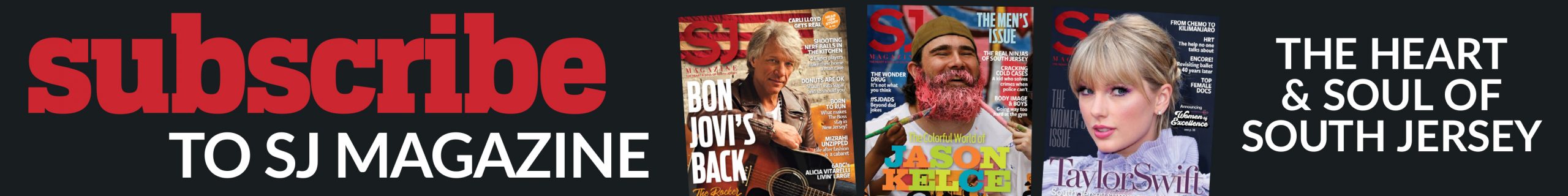
We had meeting after meeting to discuss a new logo. Do you know how many different ways you can write an “S” and a “J” side-by-side? Have you ever noticed how wide an “S” is, and how thin a “J” is? That leaves a lot of dead horizontal space in the middle, and that can put some people in my office over the edge. The width of the letters also gives the “S” more space than the “J” – that bothered me, because I didn’t want one letter to have more prominence than the other. We hashed it out, and decided on what we think is a very cool, modern logo. We all hope you like it as much as we do.
Of course, there is something everyone at SJ Magazine is keenly aware of: All of this growth we’ve had is because of our readers. Before the celebrity covers and the cool logos, we’re most proud of the connection we have with South Jersey. You’ll see on our cover that we changed our tagline from “The Heart of South Jersey” to “The Heart and Soul of South Jersey.” The addition of “and soul” came from Dr. Lyle Back. He said that’s how he perceives the magazine. In all my years here, I have never received such a wonderful compliment.
Now we begin another year. Thank you for taking this awesome ride with us so far, and I’m really happy you’ll be with us to see where we go in the years ahead. Thank you for making us an essential part of South Jersey. It’s such a great place to be.